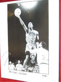
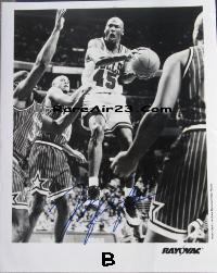
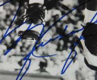
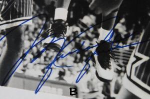
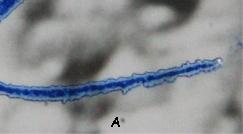
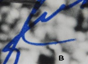
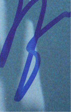
The 1987 ProServ promotional photo is by far the most realistic. Meaning that the style of signature matches the timeframe of the picture itself. Take the third image for example, The Rayovac promotional photo which bears Michael in his "45" Jersey, just by looking at the photo itself it dates from 1995, and Michael "DID NOT" sign his name in this style. I would like to emphasize on some technical factors, on close examination on all three examples show an "EXACT" duplication of his signature meaning that they are identical in size (height/length) and stroke. Each stroke of the "J" in Jordan touches the "M" in Michael exactly each time. We all know that someone can sign their name over and over and it would never be an identical match as the previous, they might be similar but not "Identical" On magnification evaluation I have notice similarties as well. I have listed the 1987 photo as subject "A" and the 1995 photo as subject "B" so there isn't any confusion.
|